Enabling Custom Paging using Apex and Visualforce
It’s a common request these days for me - which is the need to not only provide column level sorting but paging as well. While, a reusable sorting class is still a bit out of reach (though I have some ideas that I will explore in the near future), paging is something that I have been able to recently solve for in a way that is flexible and above-all portable.
In this article I will walk through how I created the class and component and explain some of the reasons I made the decisions that I did.
For the most part, I wanted to try and mimic the style of paging that Salesforce.com offers in its native list views but with a few exceptions. Below is a list of features that I decided to implement followed by a list of features that I decided not to include.
Features Include
- Ability to make any list of objects (sObject or Apex Object) pageable
- Support for displaying record counts
- Support for displaying page counts
- Support for paging navigation methods: First, Previous, Next, and Last
- Ability to override the paging navigation methods to provide your own sorting
Features Not Include
- Ability for user to dynamically change the page size
- Ability for user to jump to a specific page
The details of my particular implementation were to support the display of records that are returned from a web service. We have a number of external data sources that we provide access to for our users but for one reason or another do not want to replicate and store in Salesforce. So given the requirements at hand and knowing that I wanted to re-use this functionality elsewhere I centered on the features I included and gave a lower priority to the ones that I did not have to have day one.
Overall, it was a matter of available time and the desire to keep the implementation simple.
Pageable Class
In order to support the features I wanted, I started with a base class that I felt would best represent the methods and properties that would be common. Early on in the design I new that I would need to be creative because the Apex Language doesn’t support generics and in order for this class to support any kind of list I had to forget about storing a variable that represented the list of items to page. This meant that the pageable class could not simply be a controller class, it needed to be something that could be extended so that a custom list property could be specified.
Here is an example of a class extending the Pageable class:
public class ListCollection extends Pageable {
      List<MyClass> myData {get;set;}

      public override integer getRecordCount() {
               return (myData == null? 0 : myData.size());
      }
}
What the example code above shows is the need for a class that extends the Pageable class and defines a property for the list of objects you want to page through. Then you need to override the getRecordCount() method and return the number of records your list contains. There is a corresponding property on the Pageable class that will use this method to get the current list of records that in turn is used in the calculations to determine page size, upper and lower page boundaries, etc.
Now that you have seen a simple implementation of using the Pageable class lets explore the properties and methods.
Properties
| Name | Data Type | Description |
|---|---|---|
| PageSize | Integer | Number of records to show per page |
| PageNumber | Integer | Current page number |
| PageIndex | Integer | Zero based version of the page number |
| RecordCount | Integer | Total number of records in the pageable list |
| PageCount | Integer | Total number of pages |
| Offset | Integer | The zero based index where the current page starts |
| LNumber | Integer | The row number of the starting record in the current page |
| UNumber | Integer | The row number of the ending record in the current page |
| AllowMoveNext | Boolean | Indicates if the user can move to the next page |
| AllowMovePrev | Boolean | Indicates if the user can move to the previous page |
Methods
| Name | Can Override? | Description |
|---|---|---|
| getRecordCount | Yes | Returns the number of records to be paged |
| movePrev | Yes | Moves the paging cursor to the previous page |
| moveNext | Yes | Moves the paging cursor to the next page |
| moveLast | Yes | Moves the paging cursor to the last page |
| moveFirst | Yes | Moves the paging cursor to the first page |
| getPageCount | No | Calculates and returns the number pages based on page size and record counts |
As indicated in the Methods table most of the methods can be overridden so that you can provide your own implementation. One possible implementation could be to allow page data to be gathered dynamically. For instance, you can use the new Offset feature of the SOQL syntax to get a page of data. This allows you to provide a much more efficient page of data since the view-state will only contain records that is being displayed. To do this you would need to query the database for the next page of data when the user clicked: first, previous, first, or last. You can also use this technique with web services so that you can initiate a callout per page or perform a callout and only store a subset of the data to avoid view-state storage limit issues.
The implementation of the Pageable class is fairly simple and only represents a list of properties and methods whose primary function is to shuffle indexes around. It is it's simplicity that makes it the best representation of a re-usable component; no magic or complex logic here - just straightforward utility.
public virtual class Pageable {
	private static final integer DefaultPageSize = 50;

	//Properties
	public integer PageSize {get;set;}
	public integer PageNumber {get;set;}

	public integer PageIndex {
		get { return (PageNumber - 1); }
	}

	public integer RecordCount {
		get { return getRecordCount(); }
	}

	public integer PageCount {
		get { return getPageCount(); }
	}

	public integer Offset {
		get { return (PageSize * PageIndex); }
	}

	public integer LNumber {
		get { return RecordCount == 0 ? 0 : (Offset + 1); }
	}

	public integer UNumber {
		get {
			integer iUNum = ((LNumber + PageSize) - 1);
			return (iUnum > RecordCount) ? RecordCount : iUNum;
		}
	}

	public boolean AllowMoveNext {
		get{ return ((PageIndex + 1) < PageCount); }
	}

	public boolean AllowMovePrev {
		get{ return (PageIndex > 0); }
	}

	//Constructors

	public Pageable() {
		PageSize = DefaultPageSize;
		PageNumber = 1;
	}

	//Public Methods

	public virtual integer getRecordCount() {
		return 0;
	}

	public virtual void movePrev() {
		PageNumber--;

		if (PageNumber <= 0) {
			PageNumber = 1;
		}
	}

	public virtual void moveNext() {
		PageNumber++;

		if (PageNumber > PageCount) {
			PageNumber = PageCount;
		}
	}

	public virtual void moveLast() {
		PageNumber = PageCount;
	}

	public virtual void moveFirst() {
		PageNumber = 1;
	}

	//Private Methods

	private integer getPageCount() {
		integer iPageCount = 1;

		if (RecordCount != 0 && PageSize != 0) {
			iPageCount = (RecordCount/PageSize) + ((Math.mod(RecordCount, PageSize)) > 0 ? 1 : 0);
		}

		return iPageCount;
	}
}
Paging Toolbar Component
Now that we have seen the Pageable class that handles all the work of calculating the offsets for paging, lets look at how we enable that functionality for the user. As with the Pageable class I wanted to make sure the component could be used with any type of list. This means that the component cannot encapsulate the <apex:pageBlockTable> or <apex:dataTable> tags that you would normally use to display table data in Visualforce.
Here is an example of a page that implements the custom component
<apex:page controller="AccountDetail" tabStyle="Account">
	<apex:sectionHeader title="Account" subtitle="Paging Accounts" />

	<apex:form >
		<apex:pageBlock title="Accounts [{!Paging.RecordCount}]">
			<apex:pageBlockSection columns="1">
				<apex:facet name="body">
					<apex:outputPanel layout="none">
						<apex:pageBlockTable id="tableAccounts"
							value="{!Paging.accounts}"
							var="a"
							first="{!Paging.offset}"
							rows="{!Paging.PageSize}">

							<apex:column value="{!a.Name}" />
							<apex:column value="{!a.Industry}" />
							<apex:column value="{!a.Website}" />
						</apex:pageBlockTable>

						<c:PagingToolbar paging="{!Paging}" rerender="tableAccounts" />
					</apex:outputPanel>
				</apex:facet>
			</apex:pageBlockSection>
		</apex:pageBlock>
	</apex:form>
</apex:page>
...and here is the AccountDetail controller class that controls the page
public with sharing class AccountDetail {
    public ListCollection Paging {get;set;}

    //Construtors
    public AccountDetail() {
        try {
            Paging = new ListCollection();
            Paging.PageSize = 5;
            Paging.Accounts = queryAccounts();
        }
        catch (Exception unexpectedException) {
            ApexPages.addMessages(unexpectedException);
        }
    }

    //Query Methods
    private List<Account> queryAccounts() {
        return [SELECT Id, Name, Industry, Website FROM Account];
    }

    //Internal Classes
    public class ListCollection extends Pageable {
      public List<Account> Accounts {get;set;}

      public override integer getRecordCount() {
            return (Accounts == null? 0 : Accounts.size());
      }
    }
}
As shown by the example above I am using a standard <apex:pageBlockTable> element to display the data. However, due to some rendering issues, I had to encapsulate the block in <apex:facet> and <apex:outputPanel> tags so that the paging toolbar could properly be rendered at the bottom of the table.
You should also make note of how the paging is actually implemented. It utilizes the <apex:pageBlockTable> components ability to specify the attribute first (index of record to start displaying) equal to the offset property on the Pageable class and the rows attribute (controls number of row to display) equal to the pageSize property on the Pageable class.
Next, observe from the example above the <c:PagingToolbar> tag. This is the custom component that will actually display the navigation options. It’s important to recognize the attributes that are used because they are required. The first is the paging attribute that represents a reference to the Pageable class and the rerender attribute, which you must set to the id of the <apex:pageBlockTable> tag.
The rerender attribute is particular important to how the navigation works. Because all of the calculations are performed when each of the properties of the Pageable class are accessed, we only need to tell the table to re-render itself and through that action it will access the Pageable class to get what the current properties are. This allows the paging toolbar component to remain abstracted from the actual implementation keeping it simple and portable.
Here is what the toolbar should look like once it is rendered. This example is based on a sample list of 13 accounts with a page size of 5 records per page:
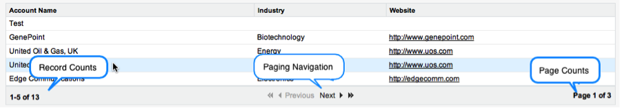
As illustrated by the screenshot above the paging toolbar will provide the interface for displaying the record and page counts along with the navigation buttons for the user to move first, previous, next, and last.
Here is the implementation for the paging toolbar component:
<apex:component id="pagingToolbar">
<apex:attribute type="Pageable"
name="Paging"
description="A reference to an object that extends the Pageable class" />
<apex:attribute type="string"
name="rerender"
description="A list of elements to rerender after a paging command is executed" />
<apex:outputPanel layout="block"
styleClass="listViewport">
<div class="bottomNav">
<div class="paginator">
<apex:panelGrid id="gridPaging"
columns="3"
width="100%"
columnclasses="left, center, right">
<apex:panelGroup >
<span class="selectorTarget">
<strong>
<apex:outputText value="{!$Label.Record_Counts}">
<apex:param value="{!Paging.LNumber}" />
<apex:param value="{!Paging.UNumber}" />
<apex:param value="{!Paging.RecordCount}" />
</apex:outputText>
</strong>
</span>
<span> </span>
<apex:actionStatus id="statusPaging">
<apex:facet name="start">
<img src="/img/loading.gif" height="14px" width="14px"/>
</apex:facet>
<apex:facet name="stop">
<img src="/img/s.gif" height="14px" width="14px"/>
</apex:facet>
</apex:actionStatus>
</apex:panelGroup>
<apex:panelGroup >
<span class="prevNextLinks">
<span class="prevNext">
<apex:commandLink id="linkMoveFirst"
immediate="true"
status="statusPaging"
action="{!Paging.moveFirst}"
rerender="{!rerender}, gridPaging"
rendered="{!Paging.allowMovePrev}">
<img src="/s.gif" title="{!$Label.First_Page}" alt="{!$Label.First_Page}" class="first" />
</apex:commandLink>
<apex:outputPanel layout="none"
rendered="{!NOT(Paging.allowMovePrev)}">
<apex:image url="/s.gif" title="{!$Label.First_Page}" alt="{!$Label.First_Page}" styleclass="firstoff" />
</apex:outputPanel>
</span>
<span class="prevNext">
<apex:commandLink id="linkMovePrev"
immediate="true"
title="{!$Label.Previous}"
status="statusPaging"
action="{!Paging.movePrev}"
rerender="{!rerender}, gridPaging"
rendered="{!Paging.allowMovePrev}">
<img src="/s.gif" title="{!$Label.Previous}" alt="{!$Label.Previous}" class="prev" />
<span>Previous</span>
</apex:commandLink>
<apex:outputPanel layout="none"
rendered="{!NOT(Paging.allowMovePrev)}">
<apex:image url="/s.gif" title="{!$Label.Previous}" alt="{!$Label.Previous}" styleclass="prevoff" />
<span>Previous</span>
</apex:outputPanel>
</span>
<span class="prevNext">
<apex:commandLink id="linkMoveNext"
immediate="true"
title="{!$Label.Next}"
status="statusPaging"
action="{!Paging.moveNext}"
rerender="{!rerender}, gridPaging"
rendered="{!Paging.allowMoveNext}">
<span>Next</span>
<img src="/s.gif" title="{!$Label.Next}" alt="{!$Label.Next}" class="next" />
</apex:commandLink>
<apex:outputPanel layout="none"
rendered="{!NOT(Paging.allowMoveNext)}">
<apex:image url="/s.gif" title="{!$Label.Next}" alt="{!$Label.Next}" styleclass="nextoff" />
<span>Next</span>
</apex:outputPanel>
</span>
<span class="prevNext">
<apex:commandLink id="linkMoveLast"
immediate="true"
status="statusPaging"
action="{!Paging.moveLast}"
rerender="{!rerender}, gridPaging"
rendered="{!Paging.allowMoveNext}">
<img src="/s.gif" title="{!$Label.Last_Page}" alt="{!$Label.Last_Page}" class="last" />
</apex:commandLink>
<apex:outputPanel layout="none"
rendered="{!NOT(Paging.allowMoveNext)}">
<apex:image url="/s.gif" title="{!$Label.Last_Page}" alt="{!$Label.Last_Page}" styleclass="lastoff" />
</apex:outputPanel>
</span>
</span>
</apex:panelGroup>
<apex:panelGroup >
<span class="selectorTarget">
<strong>
<apex:outputText value="{!$Label.Page_Counts}">
      <apex:param value="{!Paging.PageNumber}" />
      <apex:param value="{!Paging.PageCount}" />
</apex:outputText>
</strong>
</span>
</apex:panelGroup>
</apex:panelGrid>
</div>
</div>
</apex:outputPanel>
</apex:component>As shown in the example above, there are a number of CSS classes utilized. These CSS class names are actually the ones provided by the native Salesforce.com stylesheets. Since this was based on the native paging toolbar I simply re-used those class names in my implementation. This includes the images that are used to represent the move first, previous, next, and last navigation buttons.
I should caution at this point that while using the native CSS class names saved me some time it isn’t the most ideal solution. What if Salesforce changes their CSS class names? Or moves on to a new theme? The toolbar will likely appear broken or incomplete. I would recommend creating your own CSS stylesheet and images and reference it in the component as a resource. This should avoid your toolbar being broken by changes made to the Salesforce UI. For my purposes, time was a factor and despite my concerns I was comfortable that I would soon work out some time for me to go in and make the necessary updates.
If you were to copy and paste this toolbar implementation into your own instance, you may come across some errors. That is because I wanted to make sure that the code was portable and thus I didn’t want to hardcode any text that would be displayed to the user. So you will see some formula expressions that utilize the $Label syntax to retrieve the locale specific text.
Here are the custom labels that I have implemented to support the toolbar:
Custom Labels
| Name | Description | Value |
|---|---|---|
| Previous | Previous Label | Previous |
| Next | Next Label | Next |
| First_Page | First Page Label | First Page |
| Last_Page | Last Page Label | Last Page |
| Record_Counts | Record Counts Label | {0}-{1} of {2} |
| Page_Counts | Page Counts Label | Page {0} of {1} |
You will see that some of the values are using formula expressions. This is so that I can represent something like “Page 1 of 3” with a single label rather than one that says “Page” and another “of”. There really isn’t anything special about this technique. I set the value of an <apex:outputText> tag to the custom label by name and then add child <apex:param> tags in the order that they should be used in the string.
For example:
<apex:outputText value="{!$Label.Page_Counts}">
<apex:param value="{!Paging.PageNumber}" />
<apex:param value="{!Paging.PageCount}" />
</apex:outputText>Keeping it Simple
Simplicity is what I was striving for with this component and class. I wanted it to be flexible and portable. I wanted to make sure it had little to no dependencies so that I could use it in a number of different scenarios. I also wanted to make sure that I didn’t attempt to make it do more than I needed at the time of writing it.
When it comes to creating re-usable code and components it is natural to want to have it cover every scenario imaginable automatically. This will usually lead to code that is too specific or bloated to be effective. I feel with this particular implementation I was able to stay true to the simplicity I was striving for. A true test however will be in the months ahead as I increase adoption of the solution.
Feel free to build on this code to fit your needs and implement features that you feel will be beneficial to your requirements. I also encourage you to post and share your experience implementing or creating your own paging solution.